Free Access
CSS Grid vs Flexbox: When to Use Which
Rakibul Islam
Sep 14, 2026
253 views
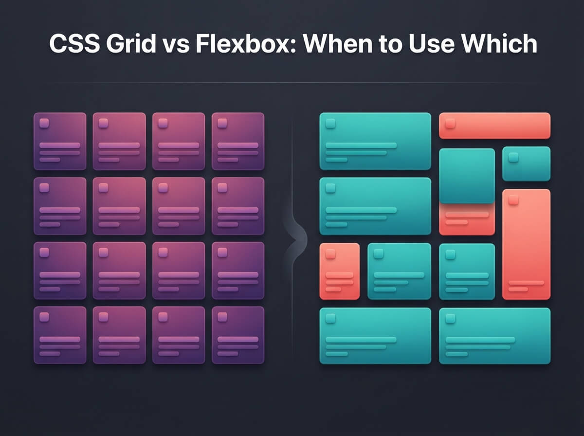
Layout Systems in Modern CSS
CSS Grid and Flexbox are two powerful layout systems that have revolutionized web design. Understanding when to use each is key to building responsive, maintainable layouts.
Flexbox: One-Dimensional Layout
Flexbox is designed for one-dimensional layouts - either a row or a column. It's perfect for:
- Navigation bars
- Card layouts
- Centering content
- Distributing space between items
CSS Grid: Two-Dimensional Layout
Grid excels at two-dimensional layouts with rows and columns. Use it for:
- Page layouts
- Dashboard grids
- Complex responsive designs
- Magazine-style layouts
Using Them Together
The best approach often combines both systems. Use Grid for the overall layout and Flexbox for component-level alignment.